gwu logos & Lockups
A compilation of unique lockups and new logos created for events, poster, shirts and more! Some of these are one off logos created for specific yearly events. Some are created for use long term use over years to come. Please enjoy looking at the uses, brand guidelines and alternative designs for each. If you like brand identity and guidelines, you’ll love this. I will go into detail, so be ready to read!
Double Dawg Day
One of the first projects I was able to design for GWU. While it is only technically one day, this massive project requires months of planning and designing with over 50 unique pieces including shirts, postcards, social designs, digital billboards, yard signs, cutouts, stickers and more! The best part of this project was getting to create the new logo after the Gardner-Webb athletic rebrand made the old version obsolete.
Description
Double Dawg Day is an event that’s goal is to raise money for the university through donor donations. With each donation, donors can take advantage of matching opportunities that could double the impact of their giving (Hence the “Double” in the name). The 8th annual day held in 2023 raised a record 1 million dollars plus! The same year I made the redesign…. what a coincidence.
The image above displays designs from the 2023 and 2024 events
2023- present Logo Details
Main Logo
Created to reflect the stacked look of the older version, this design incorporates the new dog logo that was introduced in 2022. Three colors were created for the main logo. Each can be placed on our branded color backgrounds. The dog can be seen “stepping” on the type to reflect its strength, and commanding apperance
Secondary Logo
Created to support specific needs of the project. A one color design was created for use on branded cups. The horizontal version is used in situation where the taller logo is illegible or ill-fitting.
Color Treatment
Being a sub-branded logo of a major university, the new logo not only had to adhere to the guidelines of the new dog, but also the guidelines of the branding overall. The GWU bright red, rich black and pure white are the colors chosen for this design.
Type Treatment
A new font was created in conjunction with the new dog logo called “Runnin Slab”. We decided to use an existing athletics font that is still in use to mix old branding with new branding. This allows the new dog to be associated with the well know elements of GWU and help to create brand recognition. The offset drop shadow was added to emphasize the “DAWG”.
Usage breakdown
Here is a breakdown of how the logos are used in the event graphics design. The Main logo is used mostly… obviously. The Secondary logo is growing in usage as the event expands in success. The one color logo has minimal use on some smaller more exclusive projects.
new Student Orientation 2023
Next, we take a look at another annual event logo. This logo is a one off as the theme of the event changes yearly. Different from others, this logo allows for use of images and fonts that are not on brand. If you have seen the environmental section of my portfolio, then you have had a chance to look at this already.
Description
Taking place heading into the first week of the spring semester, New Student Orientation is a 3 day event filled with social gatherings, events and games. Incoming freshmen and transfer students are introduced to campus and the surrounding area. Each year, a theme is created by students and staff. The 2023 theme was “Make Your Mark”
2023 Logo Details
Main Logo
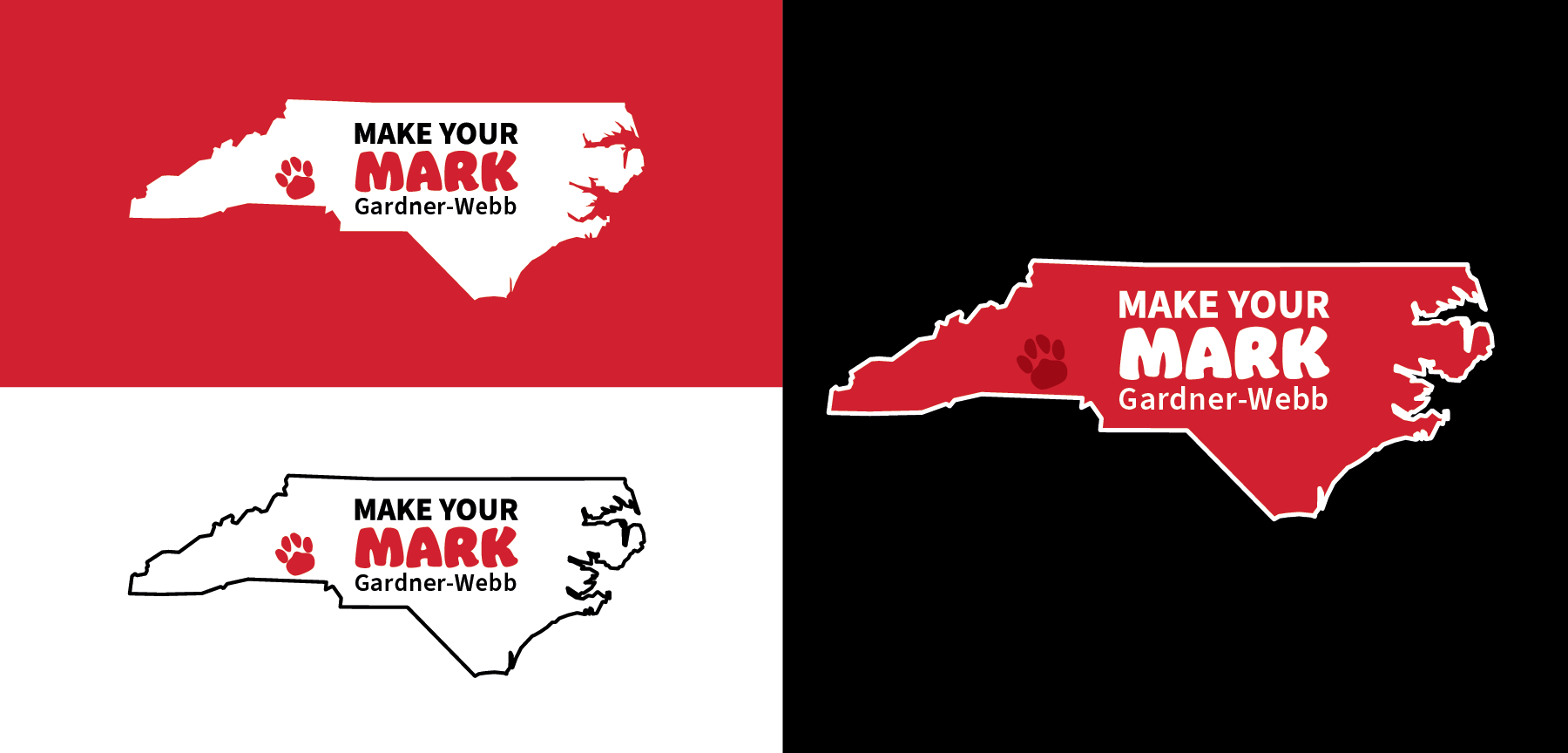
The logo and its color variations consist of 3 parts
The NC silhouette In either GWU red or white.
The “Make Your Mark” and GWU type
The university Paw Print logo which makes the location of campus.
Type Treatment
The type is a pairing of Source Sans Pro and Jumble. Jumble, the main font of the logo, is an unbranded type with one time usage for this logo. It was chosen because of its thick almost marker like stroke that gives it a playful and bold look. Source is one of the main academic fonts used for many of the designs at GWU.
Color Treatment
The 3 main colors of GWU are used for the logo with the addition of the universities dark red color. The primary red logo is unique because it does not use any black. The pairing of black text on a red background can be hard to read, because of that, the text had to be all white. Making the paw print white would make the logo unbalanced. To mitigate that, the dark red was used because when paired with the main red, it has a more subtle appearance.
Structure details
The university paw print mark is a graphic element used in background patterns and event logos. Displayed in either the up right position, or with a slight left tilt. It is a great way to associate a design with GWU without the Bulldog or flame logo. It was used in the logo to show the location of GWU on the NC map because its minimal design makes it readable when shrunk down.
Webbstock 2024
This event is a great opportunity to showcase the versatility of the GWU brand colors. Every year the events logo is changed but the font remains the same. I was able to do the event design for the 2024 year.
Description
Webbstock (A play on Woodstock) is an event hosted by Gardner-Webb and the town of Boiling Springs. For one day a year, the Main Street of Boiling Springs is closed down to make way for a stage, food vendor, and local businesses. Multiple cover bands for 70’s and 80’s music perform from the morning night.
2023 Logo Details
Main Logo
Designed with the 70’s in mind, the logo makes use of gradients and flag warps to achieve an almost psychedelic look. The white border is a container for the multiple colors used. Otherwise, the logo wouldn’t be legible on most branded colors. the small yellow stroke was used to add weight to the right side to balance the logo.
Secondary logos
Two secondary logos were created for this event. The wave is used for flags, yard signs, and banners. The second one with the year was created for social media use.
Type Treatment
Chubby and Groovy has been used in all of the Webbstock events since the first one in 2022. This thick and wavy font matches perfectly with the theme.
Color Treatment
This logo uses almost every university color. The orange and yellows are colors that are rarely used in branding but get their chance to shine in the project. The main gradient used consists of the dark red, GWU red, and dark orange. The four color gradient is used for some secondary logo designs.
Octoberfest 2023-2024
Description
Octoberfest is a yearly event held in coordination with the town of Boiling Springs. Nearing the end of October, this event features trick or treating and fun games for children all over to come and enjoy.
2023-present Logo Details
Main Logo
The main logo is made to look like a sticker. The outer white edge has a bevel and drop shadow to give it a 3D look. there is also a couple of light streaks overlayed to give the appearance of shine
Secondary logos
Two secondary logos were created for this event. The first, is a flat version of the main logo that is used for low pixel signs that cannot show much detail. The second, is a single color version used for small web images and gift bag designs. This version is easier to see when shrunk down and comes in both pure white and rich black.
Type Treatment
The type for this project was interesting. The font used is Monsteric BB. Perfect fro Halloween themed projects as the name suggests. The T’s overhang on any letter next to it. this decreased legibility and made kerning impossible. To fix this, the lettering had to be done by hand with individual outline letters.
Color Treatment
The GWU bright orange, pure white, and rich black were used in this design. Along with those, a bright non-branded purple was used for an October/Halloween theme.


